
How to make screenshots look professional
By Gauthier Huguenin · Last updated
A professional screenshot is mostly four decisions: crop tightly, add breathing room, place it on a background that contrasts with the interface, and export at the exact size of the platform you post on. Here is the whole process, step by step, in under five minutes.
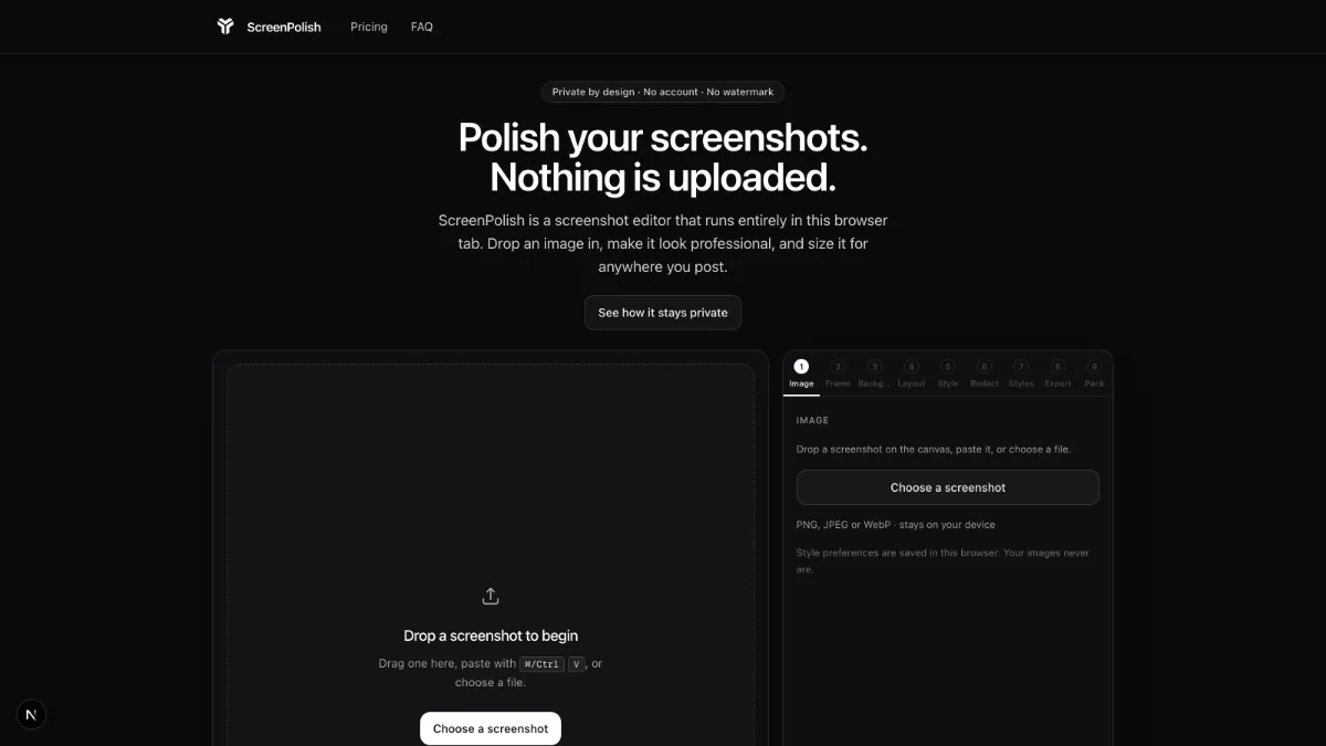
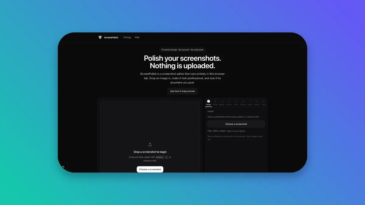
1. Start with a clean capture
Everything downstream amplifies what you capture, so capture deliberately. Close unrelated tabs and notifications, use a tidy demo account rather than production data, and crop to the part of the interface that makes your point — a whole 27-inch monitor shrunk into a timeline image communicates nothing. If the capture contains anything sensitive, deal with it now: names, emails and internal numbers are far easier to blur or block out before the image is framed and published than to chase after a post is live.
Capture at your screen's native resolution and keep the original. Scaling up a small capture later multiplies pixels that are not there; scaling down a large one is always safe.
Two capture habits pay off repeatedly. First, capture a window, not a region: every operating system has a window-capture mode (Shift-Cmd-4 then Space on macOS, Alt-PrtScn on Windows) that gives you straight edges and consistent dimensions instead of a hand-drawn rectangle that is two pixels off every time. Second, if the point you are making involves a cursor, a menu or a hover state, check it actually survived the capture — half of "the button doesn't show my tooltip" reports are just screenshots taken a frame too late.
2. Give it room: padding, corners, shadow
A raw screenshot is a rectangle of someone else's interface, and posted edge-to-edge it fights the layout around it. Three framing moves fix that. Padding puts space between the capture and the canvas edge so the image reads as a composed object instead of a crop. Rounded corners soften the hard rectangle — keep them subtle, because past a certain point the frame starts eating interface. A soft shadow lifts the capture off the background and gives it physical presence: keep it low-contrast and diffuse, because a heavy black drop shadow reads as a 2005 clip-art effect, not depth.
If you want a starting point: a corner radius around 12% of the image's shorter edge (the unit the editor's slider uses), padding that leaves the capture a clear margin on every side, and a shadow soft enough to read as light rather than outline. Those are the defaults the editor applies the moment you drop an image in, so the starting point already looks composed and every adjustment is a preference, not a rescue.
The test for all three is the same: if you notice the effect before you notice the screenshot, dial it back. Framing exists to direct attention at the interface; the moment the frame competes with it, the frame has failed.
3. Choose a background that serves the content
The background's job is contrast, not decoration. A light interface pops on a dark or saturated backdrop; a dark-mode capture needs something lighter or more colourful behind it. The principle is the same one accessibility guidelines apply to text: sufficient contrast is what makes content legible at a glance — WCAG 2.2 sets 4.5:1 as the minimum ratio for normal text for exactly that reason. You are not publishing a WCAG audit, but the instinct transfers: if the screenshot's edge blurs into the backdrop, the backdrop is wrong.
Gradients work well because they add colour without adding detail that competes with the interface. Solid colours are safer for brand consistency. Busy photos behind UI are almost always a mistake. If you post regularly, pick one or two backgrounds and stay with them — the repetition itself becomes recognisable.
Temperature matters too. Blue-to-violet gradients read as calm and technical, and flatter most dark interfaces; warm oranges and pinks energise a light interface but can clash with the blues that dominate dashboards. And check the pairing both ways: a dark-mode capture on a near-black backdrop loses its silhouette entirely, which is the most common background mistake in developer changelogs. When in doubt, put dark UI on colour and light UI on colour — colour is the frame that neither mode brings with it.
4. Size it for the platform
Every platform renders images at its own ratio, and anything else gets cropped or letterboxed by someone else's algorithm. The reliable numbers, from the platforms' own documentation: link previews follow the Open Graph convention, where Facebook recommends at least 1200×630 pixels at a ~1.91:1 ratio; LinkedIn specifies 1200×627 for shared-post images; and Product Hunt asks for 1270×760 gallery images. X displays single photos across ratios from 2:1 to 3:4; 16:9 remains a reliable landscape choice.
Why it matters: when the ratio is wrong, the platform decides for you. Feeds crop from the centre outward, so off-ratio images lose their edges — usually the toolbar or the punchline of the interface you were showing. Letterboxing survives with bars that make the post look like an accident, and oversized images get re-encoded on upload by pipelines tuned for photos, not text. Exporting once per destination, at that destination's ratio, is thirty seconds of work that keeps those decisions yours.
You do not need to memorise any of this: the full, dated tables live in the social media image sizes reference, and each of those ratios is a one-click canvas preset in the editor.
5. Export without losing quality (PNG vs JPEG vs WebP)
Screenshots are mostly text and sharp edges, which is exactly what lossy photo compression is worst at. MDN's format guidance is blunt about it: use a lossless format for screenshots, because text "easily becomes fuzzy and unclear under lossy compression". In practice: PNG is the safe lossless default every platform accepts. WebP is the better lossless format where you control the destination — Google measures WebP lossless at 26% smaller than PNG, and its lossy mode 25–34% smaller than comparable JPEG. JPEG is the fallback for photo-heavy captures where file size matters more than crisp text.
Two practical notes. If your framed export uses a transparent background — a floating window with no backdrop — you need a format with an alpha channel, which means PNG or WebP; JPEG has none and will fill the transparency with a solid colour. And export at 2x when the image will be viewed on high-density displays, which for social feeds is most of the time: a 1200×675 canvas exported at 2x produces a 2400×1350 file that stays sharp when the platform scales it down.
Resolution is where quality quietly dies, so mind the pipeline: if you captured at 2x on a high-density display, keep working at 2x and let the platform do the only downscale. Every extra resize — a 1x export blown back up, a chat app's thumbnail re-shared as the image itself — softens text a little more, and screenshots are mostly text.
That is the entire craft: capture clean, frame with restraint, contrast the background, size for the destination, export lossless. A screenshot beautifier exists so the middle three steps take seconds instead of a design tool — the editor is already open. Try it.